Concept & prototype
PRiME · University of Toronto · 2026

An immersive story for precision medicine.

A redesign concept for the homepage of PRiME, the University of Toronto’s Precision Medicine initiative — built as a working prototype. The goal was to make complex interdisciplinary research understandable without giving up scientific credibility.

Role
Digital strategy · UX & information architecture · Visual direction · Interaction design · Front-end prototyping
Year
2026
Stack
Next.js 16 · React 19 · TypeScript · CSS Modules · GSAP · HTML Canvas
Status
Concept and interactive prototype — not the official PRiME website

View the live prototype →

Scroll through the work
01 · The challenge

Many signals, one story.

Precision medicine runs on interconnected biological, clinical, technological and social signals. A homepage has to carry those relationships to two audiences at once — researchers who already know the field, and a public that does not.

The institutional default is a wall of programme names. The brief I set myself was the opposite: lead with the idea, let structure carry the detail, and stay refined enough to sit under a University of Toronto masthead.
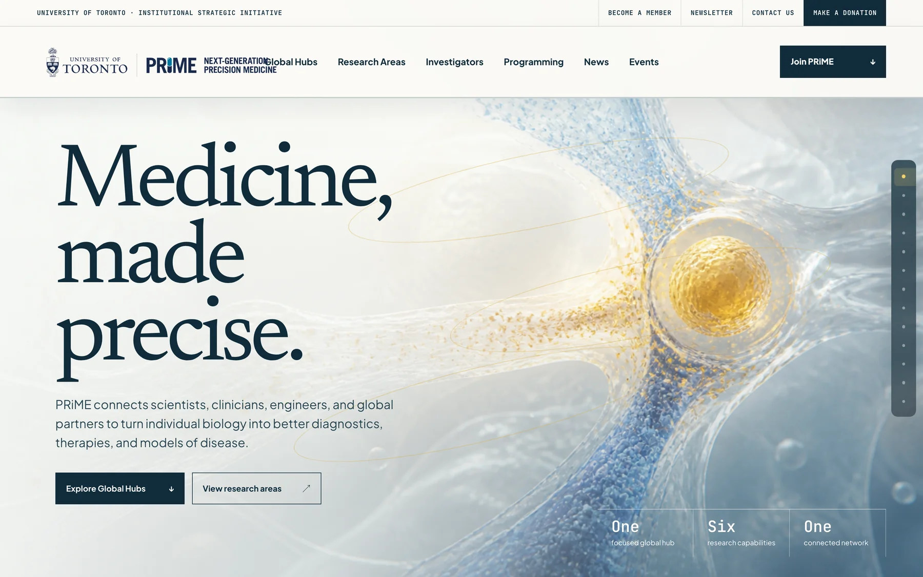
The PRiME concept homepage hero: the headline ‘Medicine, made precise’ over a cinematic gold-and-blue composition.
The opening frame. “Medicine, made precise” sets the tone before any navigation appears.
02 · Experience strategy

One continuous composition.

Rather than a stack of independent modules, the homepage reads as a single full-width composition. Each section hands off to the next, so a visitor who scrolls without clicking still receives the argument in order: the problem, the approach, the network, the capabilities, the people, the ways in.

  • Open
    A cinematic statement establishes tone before any navigation is required.
  • Frame
    “One disease. Many signals.” names the central idea in six words.
  • Prove
    Global hubs and six capabilities show the work behind the claim.
  • Enter
    Leadership, programming, news and membership give a reader somewhere to go.
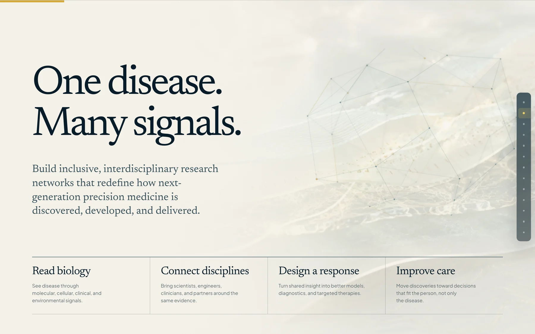
The ‘One disease. Many signals.’ section, with four columns reading biology, connecting disciplines, designing a response and improving care.
The central idea in six words, then unpacked across four steps: read biology, connect disciplines, design a response, improve care.
03 · Global Research Hubs

Opening from space.

The hubs sequence begins with Earth and moves inward to the three research hubs — Precision Ageing and Brain Health, Precision Oncology, and Precision Women’s Health. Each hub gets an interactive presentation of its own rather than a paragraph in a list.

The sequence is scroll-driven on desktop and collapses to a stacked, tappable set on smaller screens. It can be paused or skipped, and it does not run at all when a visitor has asked for reduced motion.

The Global Research Hubs sequence opening on Earth seen from space, with pause and skip controls in the corner.
The hubs sequence opens on Earth. Skip and pause controls sit in the corner, and the sequence is static under reduced motion.
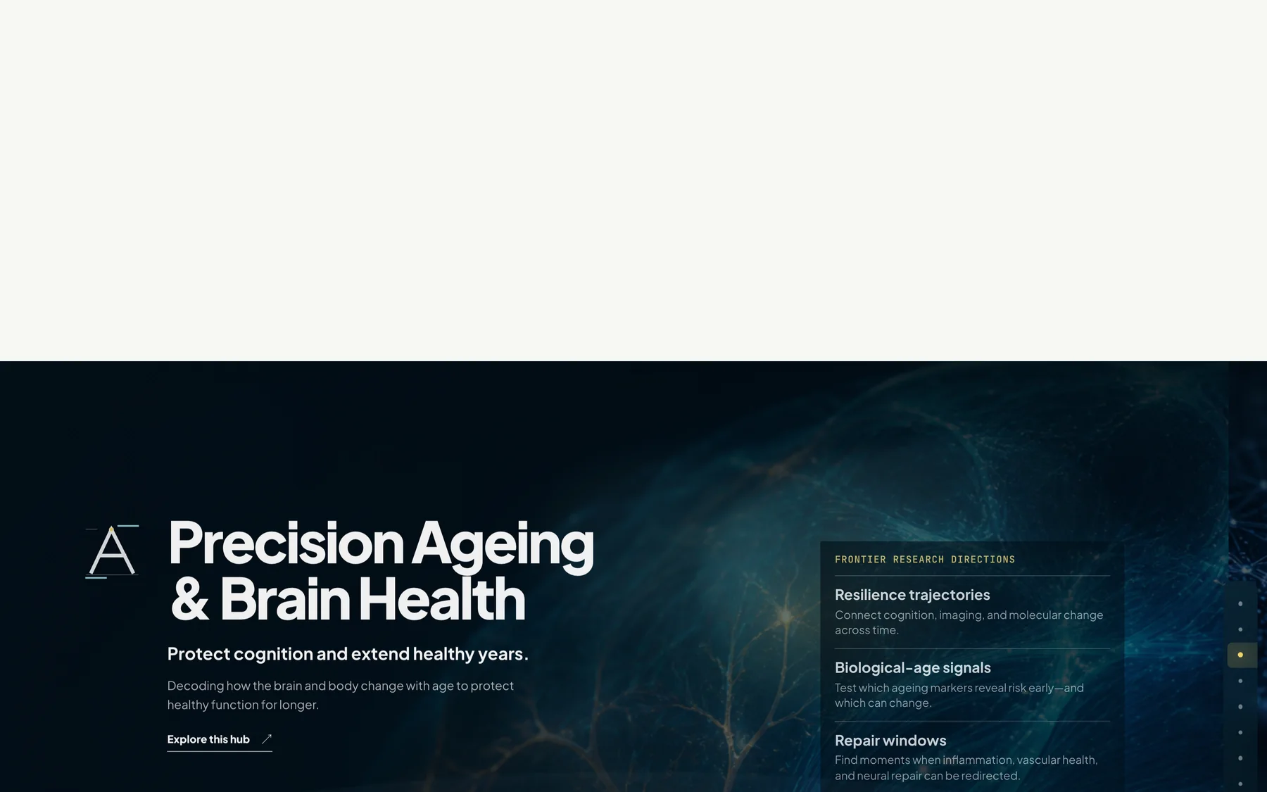
A single research hub state: Precision Ageing and Brain Health, with resilience trajectories, biological age engines and repair windows listed beside it.
One hub state. Each of the three hubs gets its own interactive presentation rather than a paragraph in a list.
04 · Research capabilities

Six ways to discover.

Six capabilities — from biologics and protein engineering through to high-throughput omics — share one visual system, so they read as a connected platform rather than six unrelated labs. The typographic treatment stays constant; only the imagery changes.
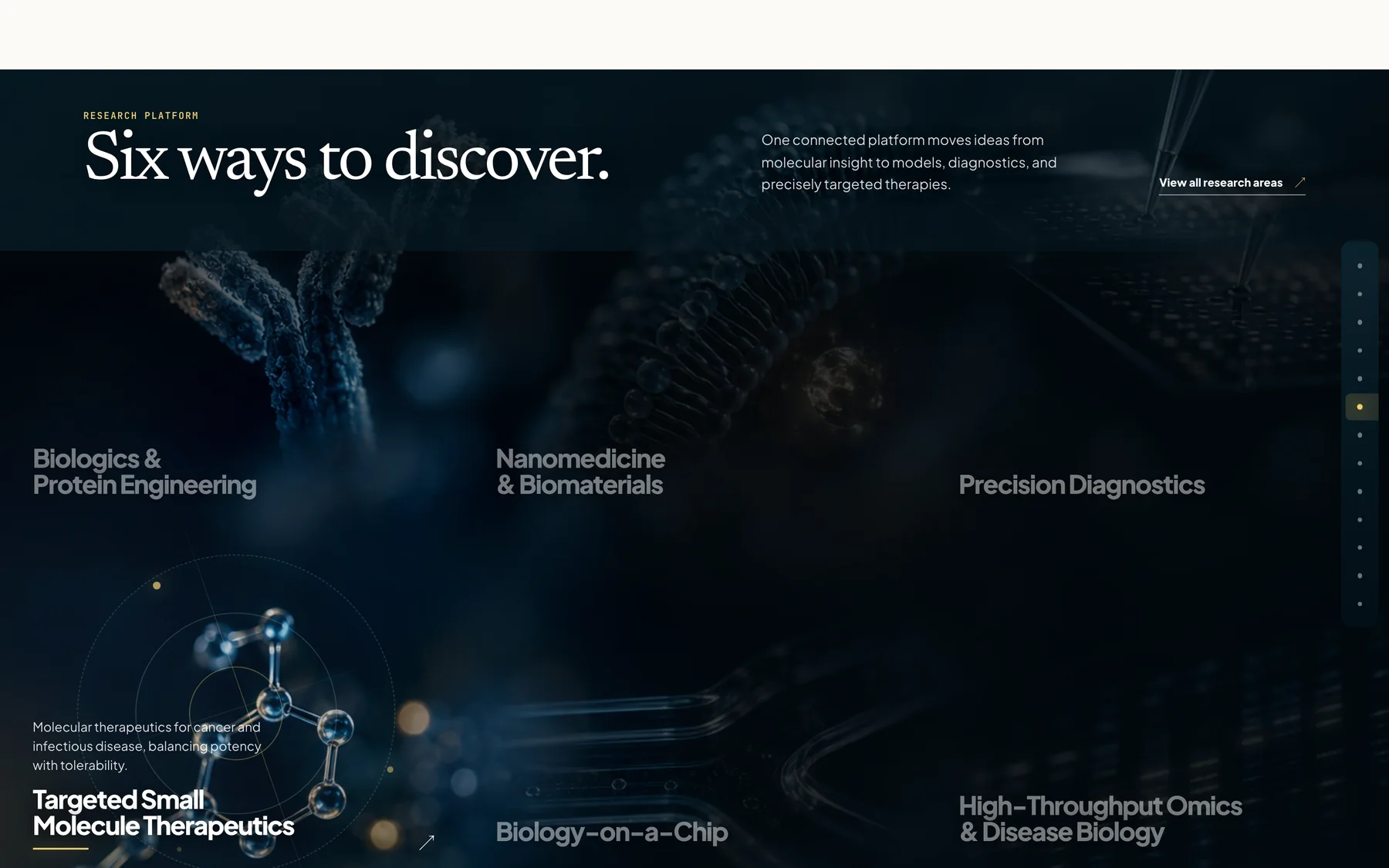
The six research capabilities section titled ‘Six ways to discover’, listing biologics and protein engineering, nanomedicine and biomaterials, precision diagnostics, targeted small-molecule therapeutics, biology-on-a-chip and high-throughput omics.
Six capabilities under one visual system, so the platform reads as connected rather than as six separate labs.
05 · People and programmes

The network, legible.

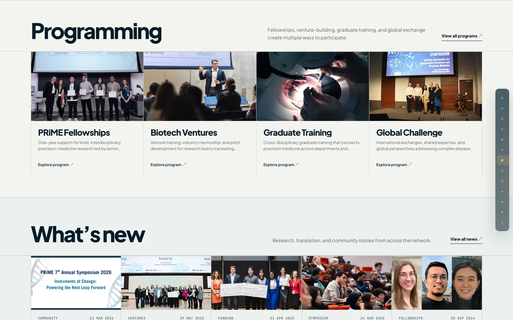
Scientific leadership and the administrative team were redesigned as a single directory with consistent portraiture and a clear role hierarchy. Programming, news, events and the social feed were streamlined into scannable rows, with a draggable content strip that also works from the keyboard.
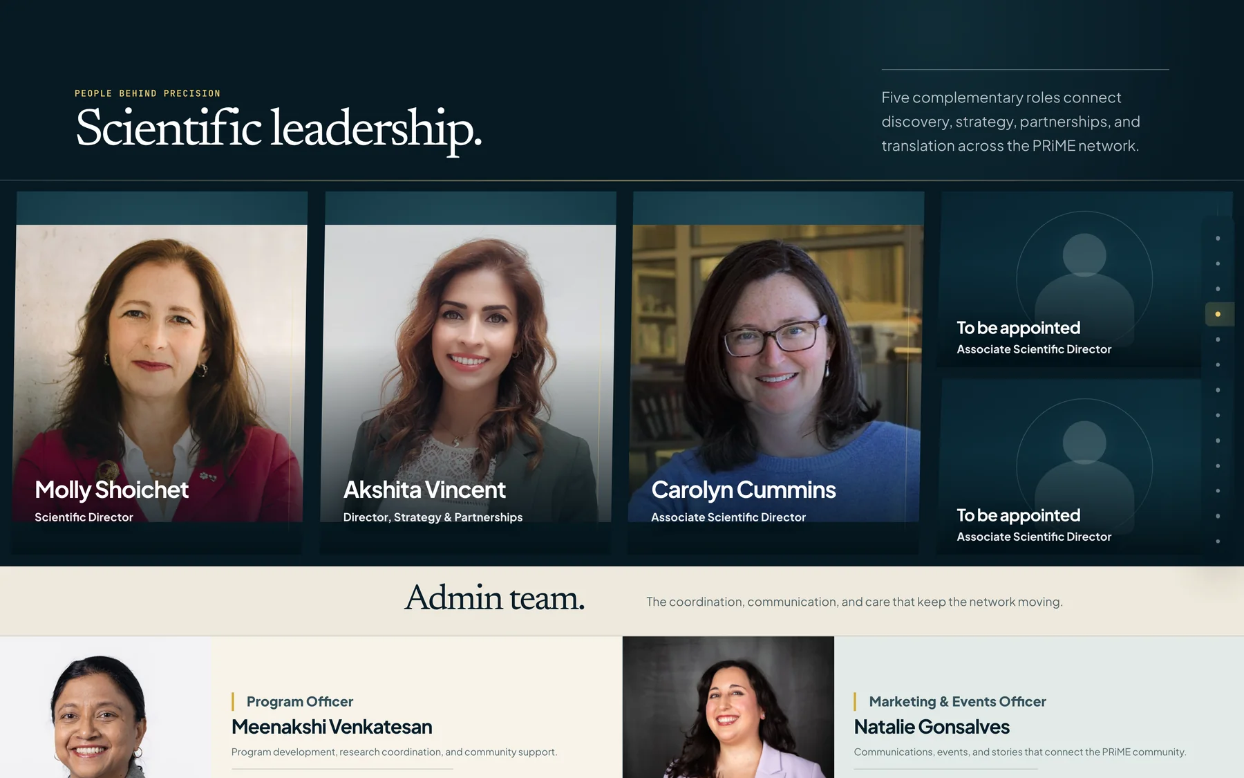
The scientific leadership and administration directory, showing named leaders with their roles alongside to-be-appointed placeholders.
Leadership and administration as one directory with consistent portraiture and a clear role hierarchy.
The programming and news sections, showing PRiME fellowships, biotech ventures, graduate training and a global challenge alongside recent news items.
Programming and news, streamlined into scannable rows on a single card pattern.
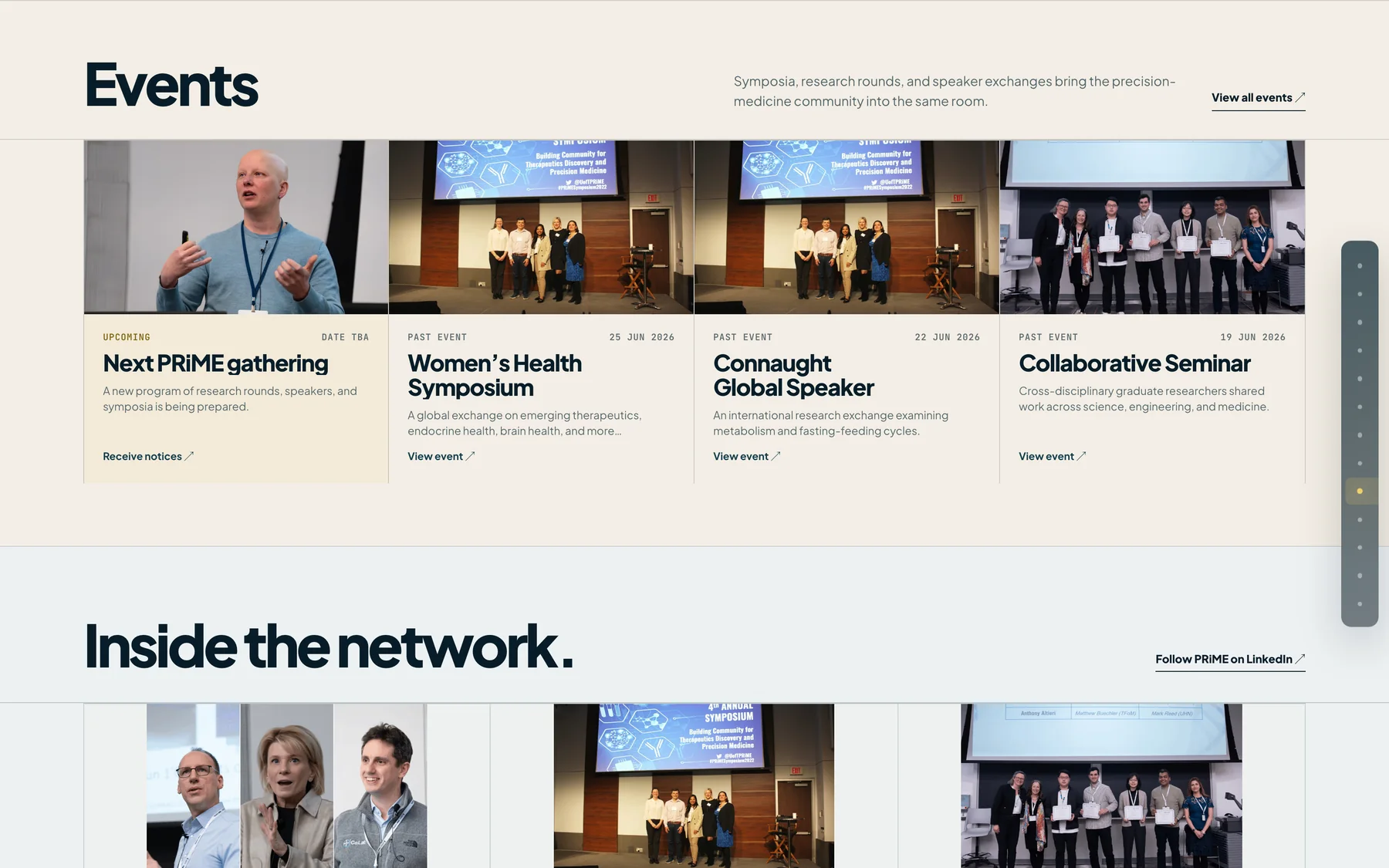
The events section and the social feed titled ‘Inside the network’, showing upcoming gatherings and a draggable strip of community content.
Events and the community feed. The strip is draggable by pointer and operable from the keyboard.
06 · Motion and interaction

Motion that explains.

Animation is used where it carries meaning — revealing relationships, sequencing an argument, showing scale — and nowhere else. GSAP with ScrollTrigger drives the scroll choreography; a custom HTML Canvas layer handles the Earth and signal sequences that CSS cannot express.

  • Scroll choreography
    GSAP ScrollTrigger and ScrollTo, with pinned sequences released back to normal scrolling.
  • Canvas layer
    Custom HTML Canvas animation for the space-and-Earth opening and the signal field.
  • Draggable strip
    Pointer dragging for the community feed, with full keyboard operation and visible focus.
  • Reduced motion
    Motion-heavy sequences resolve to a static state when the visitor prefers reduced motion.
07 · Responsive and accessible

Refined on every screen.

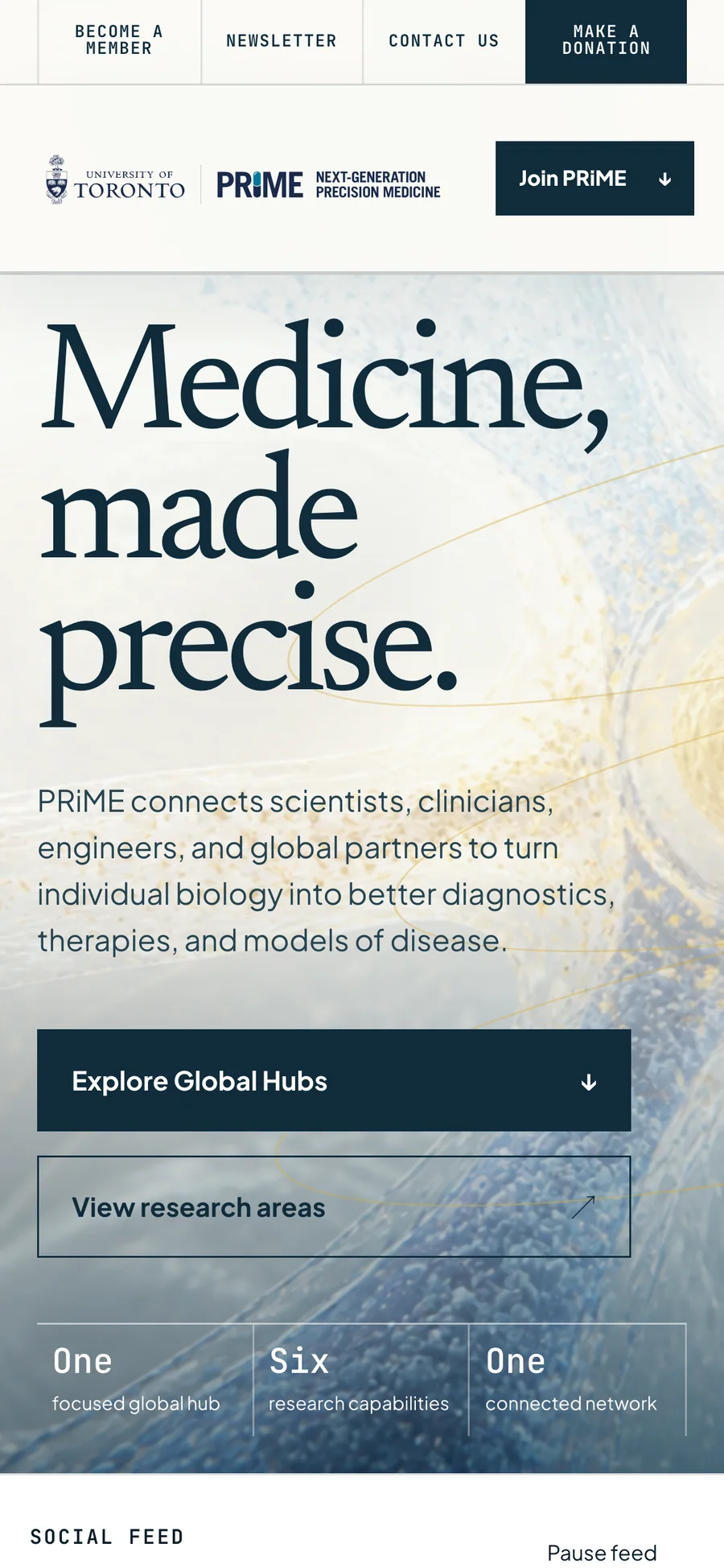
Desktop, tablet and mobile each get a layout rather than a reflow. On phones the cinematic sequences become stacked, tappable panels, so nothing depends on a hover state or a wide viewport.
On accessibility: the implementation targets AODA and WCAG 2.1 Level AA — semantic headings, visible focus, keyboard operation of every interactive element, and reduced-motion behaviour were designed in rather than retrofitted. This is a concept prototype and has not been through a formal accessibility audit or certification.
The PRiME concept homepage on a phone: the headline ‘Medicine, made precise’ above stacked entry points to the global hubs and research areas.
The opening composition on a phone. The cinematic layer stays; the interaction never depends on a wide viewport.
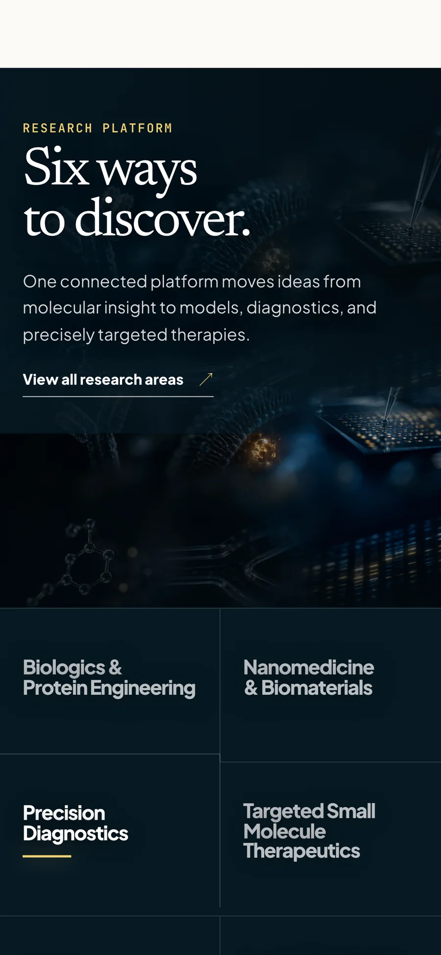
The six research capabilities on a phone, stacked as tappable panels under the heading ‘Six ways to discover’.
Six capabilities become a stacked, tappable set — no hover states, no horizontal scrolling.
08 · Technical implementation

Built to hand over.

The prototype is a real Next.js application rather than a set of flat mockups, so its structure can be reviewed and inherited. Content is modelled so it could move onto a WordPress-backed editorial workflow without redesigning the front end.

  • Framework
    Next.js 16 App Router, React 19, TypeScript
  • Styling
    CSS Modules, scoped per section
  • Motion
    GSAP with ScrollTrigger and ScrollTo, plus custom HTML Canvas
  • Content
    Structured content model, planned for WordPress compatibility
  • Delivery
    Deployed on Vercel
  • Source
    Private repository — available on request
A note on the imagery: the cinematic visuals in this concept are art direction, not depictions of specific scientific processes or results. The PRiME and University of Toronto names and marks belong to the University of Toronto and appear here to identify the subject of the concept.

A concept is only an argument until somebody can scroll it.

The prototype is live and interactive — the hubs sequence, the capability system and the draggable feed all behave as described here.

Open the live prototype →